You’re done with the basic design of your website and now you want to code it in HTML.
For this you need to be aware of the different layout options available in HTML/CSS and which of those is the right fit for your website design. Let us go through the options one by one.
Tables - Do Not Do This!
This was used earlier when the web was still in its infancy, and there wasn’t much you could do with a website except display text. The developers had got used to designing websites using <table> element and stuck to it even when new things (CSS, images, animations, small screens) came into the picture.
<html>
<body>
<table width="600px" cellspacing="0" cellpadding="0" align="center">
   <tbody>
      <tr>
      <td>

         <table width="600px" bgcolor="red" cellspacing="0" cellpadding="0">
         <tbody>
            <tr>
               <td height="130px">
               <h1>Header</h1>
               </td>
            </tr>
         </tbody>
         </table>

     </td>
     </tr>
     <tr>
     <td>

        <table width="600px" cellspacing="0" cellpadding="0">
        <tbody>
           <tr><td height="10px"></td></tr>
           <tr>
              <td bgcolor="yellow" width="400px" height="450px">
              <h1>Main</h1>
              </td>

              <td width="5px"></td>

              <td bgcolor="orange" width="195px" height="450px">
              <h1>Aside</h1>
              </td>

           </tr>
           <tr><td height="10px"></td></tr>
        </tbody>
        </table>

     </td>
     </tr>
     <tr>
     <td>

        <table width="600px" height="80px" bgcolor="green"
cellspacing="0" cellpadding="0">
        <tbody>
           <tr>
           <td>
           <h1>Footer</h1>
           </td>
           </tr>
        </tbody>
        </table>

     </td>
     </tr>
  </tbody>
</table>
</body>
</html>
Websites designed using <table> element are fixed in nature. They can’t be redesigned to handle new changes, everything will have to be rewritten completely. This is because the <table> element is meant to display only tabular data, and nothing more. So do not use it for website layout!
When we look at the other options available, you will realise why it’s so bad to use the Table-based layout. Especially when you are trying to create responsive websites.
A bit of history: When the CSS standard arrived in 1996, it helped alleviate the problems created by table-based layout. The <div> element ruled the layout design for a long time, until the CSS 2.1 standard was finally published in 2011 and float walked in to claim the throne!
Float - The Classical Way
The CSS Float property is used to float elements in a website. For example, you can float an image next to a body of text. This is <float> in its simplest usage. The same concept can be used to design an entire website.
img {
  float: right;
}
For designing an entire website, the basic idea to understand is that the <float> element can be used to design an n-column layout. We can combine this with the <div> element to create a layout as given below.
<div class="header"></div>
<div class="topmenu"></div>
<div class="content">
  <div class="sidebar"></div>
  <div class="mainbar"></div>
</div>
<div class="footer"></div>
/* Create two columns that floats next to each other */
.sidebar {
    float: left;
    width: 30%;
}

.mainbar {
    float: left;
    width: 70%;
}

/* Clear floats after the columns */
.content:after {
    content: "";
    display: block;
    clear: both;
}
Today, a website can be accessed from so many different devices - mobiles, tablets, laptops, PCs. So, how would you ensure that your website looks good on any device? The answer is Responsive Web Design. It has only one guiding principle: A web page should look good on any device!
w3schools has a rather neat definition: “Responsive Web Design is about using HTML and CSS to automatically resize, hide, shrink, or enlarge, a website, to make it look good on all devices (desktops, tablets, and phones).”
Now, if you want to make sure that your website is responsive and looks good on all kinds of devices then you can do something like the code below.
Add the following <meta> element to all your web pages:
<meta name="viewport" content="width=device-width, initial-scale=1.0">
Modify the CSS to add a media query:
/* Create two columns that floats next to each other */
.sidebar {
    float: left;
    width: 30%;
}

.mainbar {
    float: left;
    width: 70%;
}

/* Use a media query to add a breakpoint at 800px: */
@media screen and (max-width: 800px) {
  .sidebar, .mainbar {
    width: 100%; /* The width is 100%, when the viewport is 800px or smaller */
  }
}

/* Clear floats after the columns */
.content:after {
    content: "";
    display: block;
    clear: both;
}
This basically makes the website display as a single column for devices with resolution smaller than 800px (most tablets and all smartphones). Why do this you ask? Imagine looking at a two-column website on your mobile device and trying to read the content. It’s not appealing, is it?!
Flex - The Responsive Way
CSS Flexbox makes it quite simple to design flexible responsive layout for websites. It takes the concept behind float and streamlines it for easy adoption. The above code can be rewritten as follows:
/* Flexbox Layout */
.content {
  display: flex;
  flex-direction: row;
}

/* Use a media query to add a breakpoint at 800px: */
@media screen and (max-width: 800px) {
  .sidebar, .mainbar {
    width: 100%; /* The width is 100%, when the viewport is 800px or smaller */
  }
}
It’s that simple.
You can imagine your website to be a hierarchy of Flexbox elements, starting with the body element, and diving down into the depths till you reach the individual components on each page. Once you start adding <flex> elements to your website, it will become second nature to think of your layout in terms of <flex> properties. That’s how powerful Flexbox is!
I won’t add anything more here, because there is a beautiful website which already explains Flexbox and its properties in detail. This CSS Tricks page is my go-to reference for all things flex!
Grid - The Future
By now you should be able to spot the issue with using <flex> to design an entire layout. It is a one-dimensional tool (a row/column layout), and as such has to be adapted to be used for designing a website layout which is two-dimensional. This is why you will end up with a hierarchy of nested Flexbox elements in your layout design.
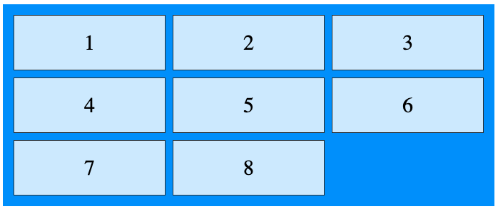
Grid solves this by providing a two-dimensional layout that can be designed as per your requirements. The below code creates a 3-column layout of 8 items.
<div class="grid-container">
  <div class="grid-item">1</div>
  <div class="grid-item">2</div>
  <div class="grid-item">3</div>
  <div class="grid-item">4</div>
  <div class="grid-item">5</div>
  <div class="grid-item">6</div>
  <div class="grid-item">7</div>
  <div class="grid-item">8</div>
</div>
.grid-container {
  display: grid;
  grid-template-columns: auto auto auto;
}
.grid-item {
  text-align: center;
}
Going by the example above, you can design a layout of your website using the CSS grid as follows.
<div class="grid-container">
  <div class="item1">Header</div>
  <div class="item2">Menu</div>
  <div class="item3">Main</div>
  <div class="item4">Right</div>
  <div class="item5">Footer</div>
</div>
.item1 { grid-area: header; }
.item2 { grid-area: menu; }
.item3 { grid-area: main; }
.item4 { grid-area: right; }
.item5 { grid-area: footer; }

.grid-container {
  display: grid;
  grid-template-areas:
    'header header header header header header'
    'menu main main main right right'
    'menu footer footer footer footer footer';
  grid-gap: 10px;
}

.grid-container > div {
  text-align: center;
}
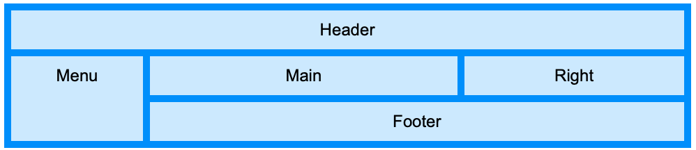
The grid-template-areas is a great way to structure your layout. It’s represented visually in code and is easily understandable. Comparing this with the earlier ways (the rigid structure of the tables, the cumbersome floats and the multi-level hierarchy of the flexbox), we can see how easy the CSS Grid has made designing a layout!
After going through each of the above, you can see that a pattern has emerged.
- The CSS Grid is best suited for designing entire layout of the website.
- The CSS Flexbox is optimal for designing individual rows or columns of components.
- Responsive Web Design should be considered in the beginning stages of website design. You should have a pretty good idea about how your website will look on every kind of device.
- And finally, DO NOT use Tables for layout design.
I hope this post has been easy to understand and has added to your CSS/HTML knowledge. Please don’t hesitate to ask any questions that you may have!
Until the next bog post..